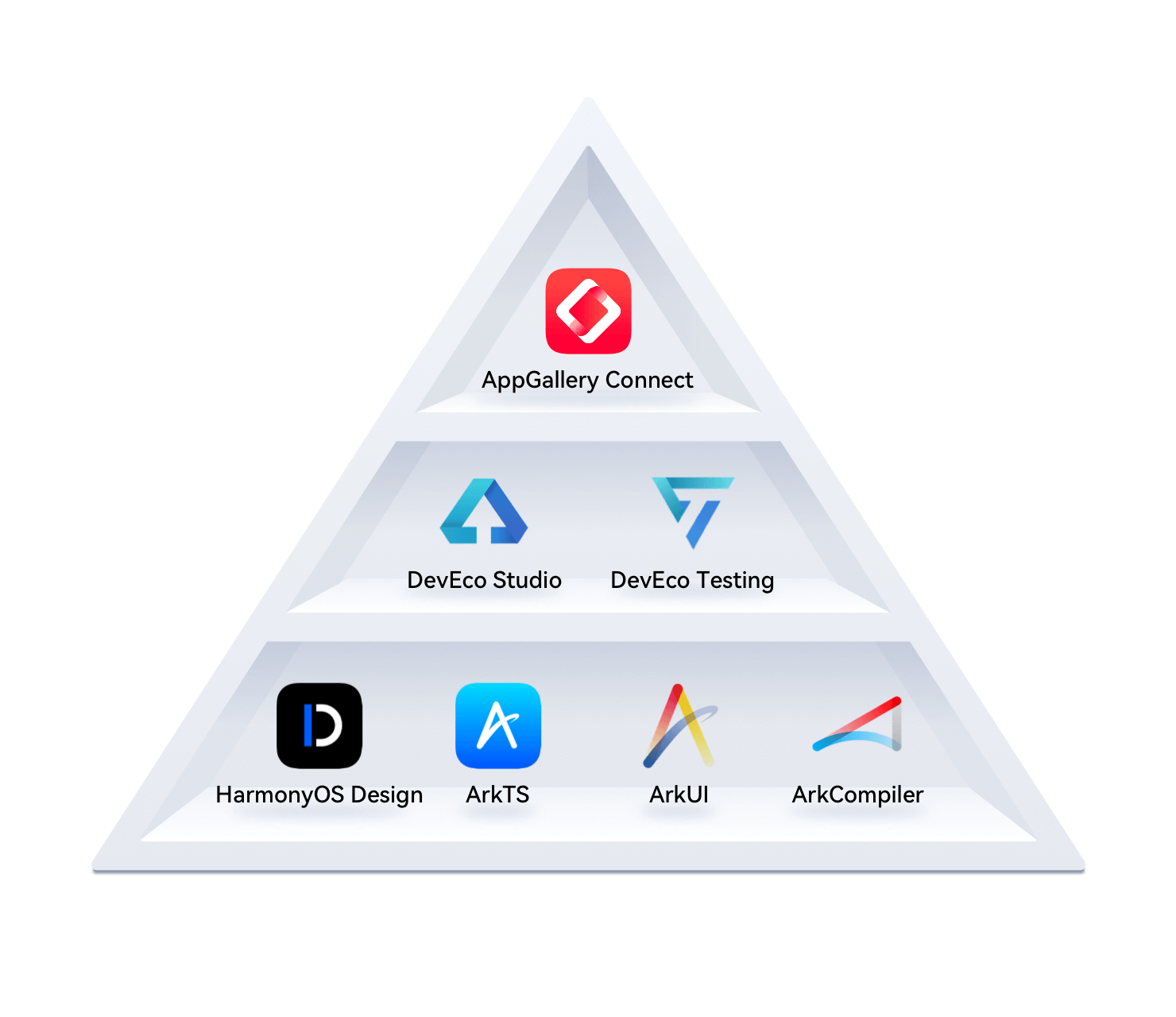
鸿蒙-1. 组件基础
开发环境
1. 起步-鸿蒙简介
介绍:
HarmonyOS 是新一代的智能终端操作系统,为不同设备的智能化、互联与协同提供了统一的语言。带来简洁,流畅,连续,安全可靠的全场景交互体验。
历程:
时间
事件
2019
HarmonyOS 1.0,华为在东莞举行华为开发者大会,正式发布操作系统鸿蒙 OS,主要用于物联网
2020
HarmonyOS 2.0,基于开源项目 OpenHarmony 开发的面向多种全场景智能设备的商用版本
2021
HarmonyOS 3.0,先后优化游戏流畅度、地图三维体验、系统安全,另外系统的稳定性也得到了增强
2023.2
HarmonyOS 3.1,系统纯净能力进一步提升,对后台弹窗、 隐藏应用、后台跳转等情况
2023.7
华为 Mate 50 系列手机获推 HarmonyOS 4.0
2024 HarmonyOS Next 即将发布,将不在兼容安卓应用
和我们有什么关系?
环境弱行业卷,怎么办?
纯鸿蒙应用开发潮,你跟不跟?
前端技术迁移鸿蒙开发易上手,你学不学?
2. 起步-DevEco Studio
安装 DevEco Studio 编辑器
下载:https://developer.harmonyos.com/cn/develop/deveco-studio#download
Windows(64-bit)
Mac(X86)
Mac(ARM)
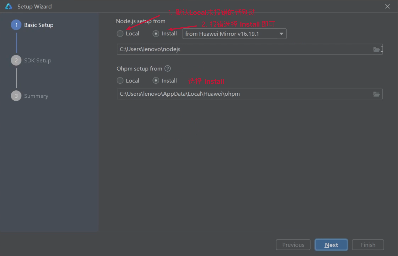
安装:DevEco Studio → 一路 Next
运行:
基础安装:Node.js >= 16.9.1 + Install ohpm 鸿蒙包管理器
SDK 安装
安装完毕
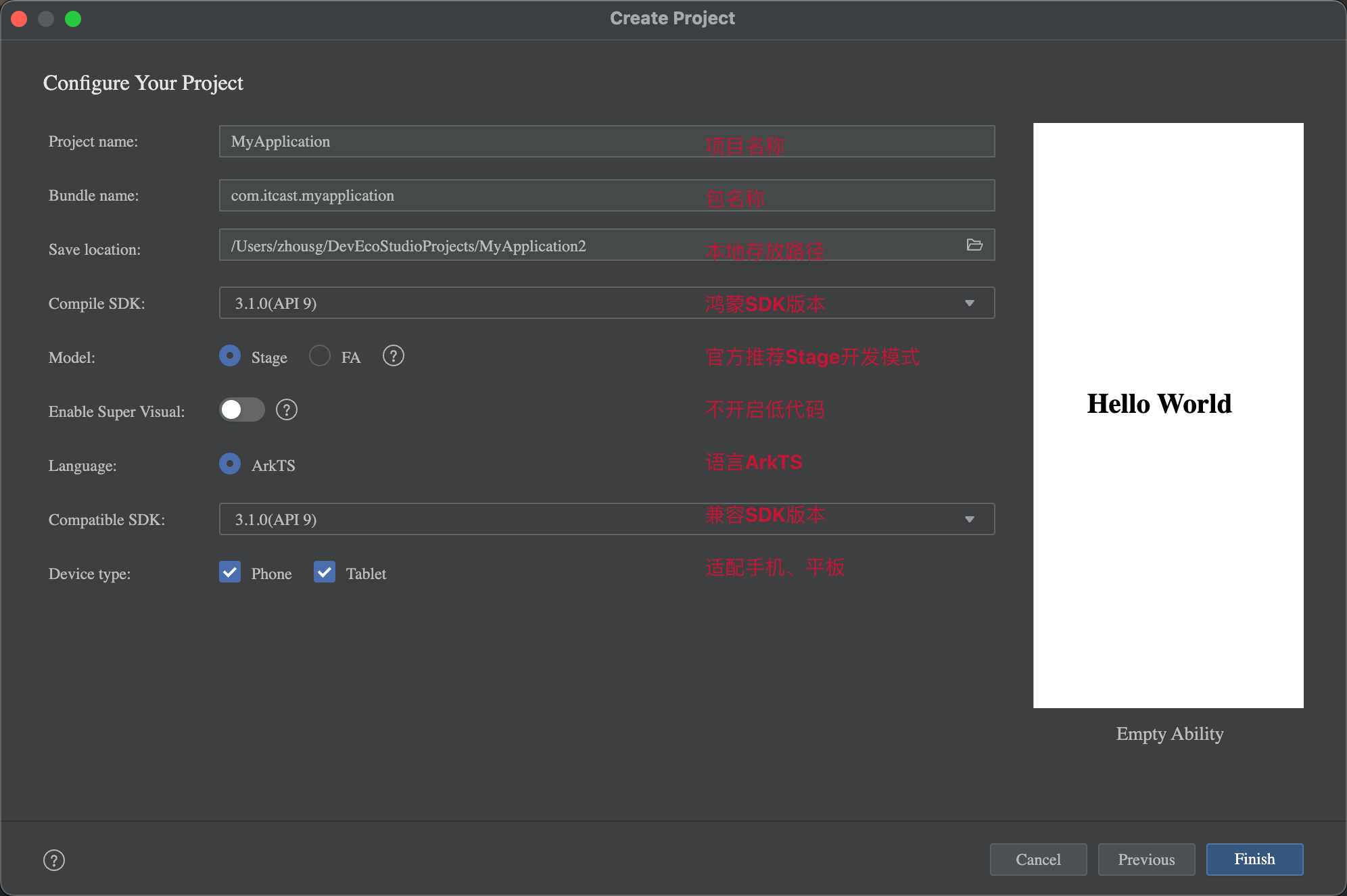
3. 起步-HelloWorld
创建一个空项目:
Create Project
选择项目模板
填写项目信息
Finish
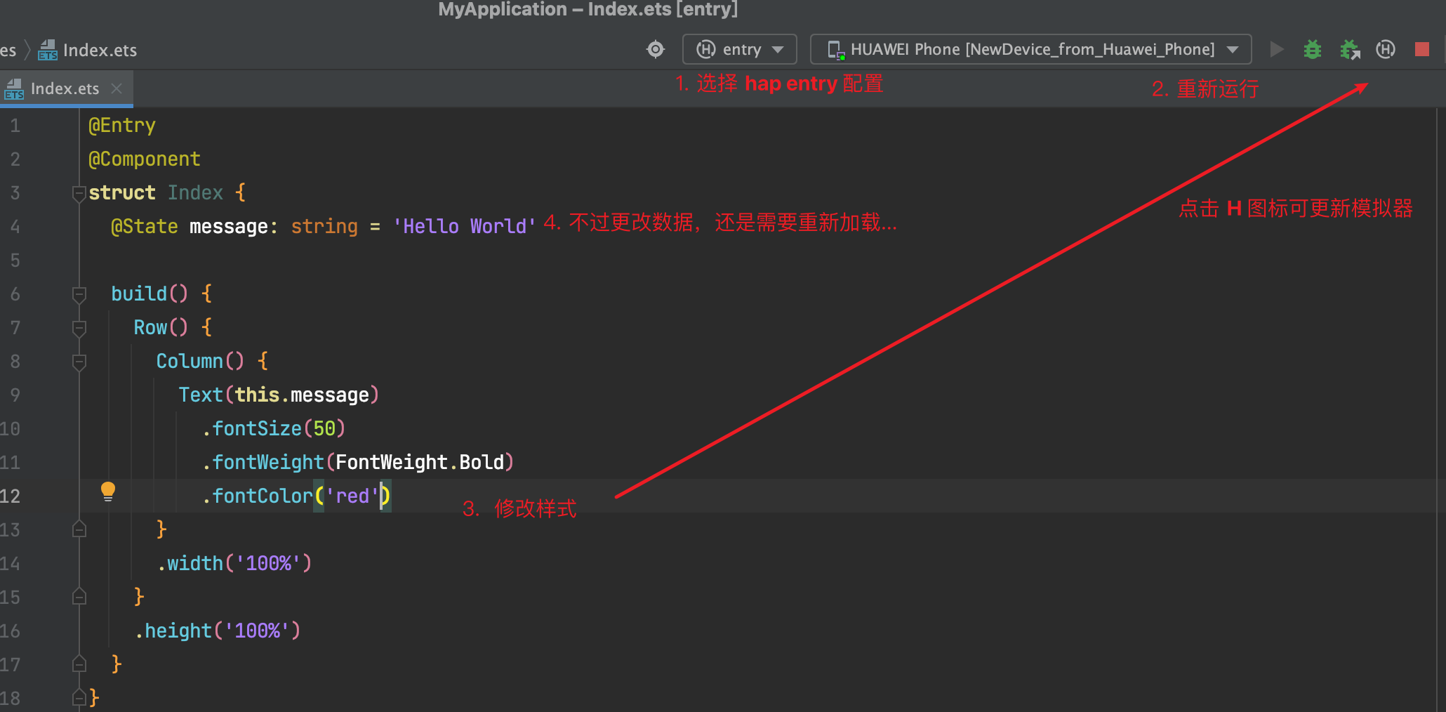
4. 起步-效果预览
效果预览方法:
Previewer 预览模式
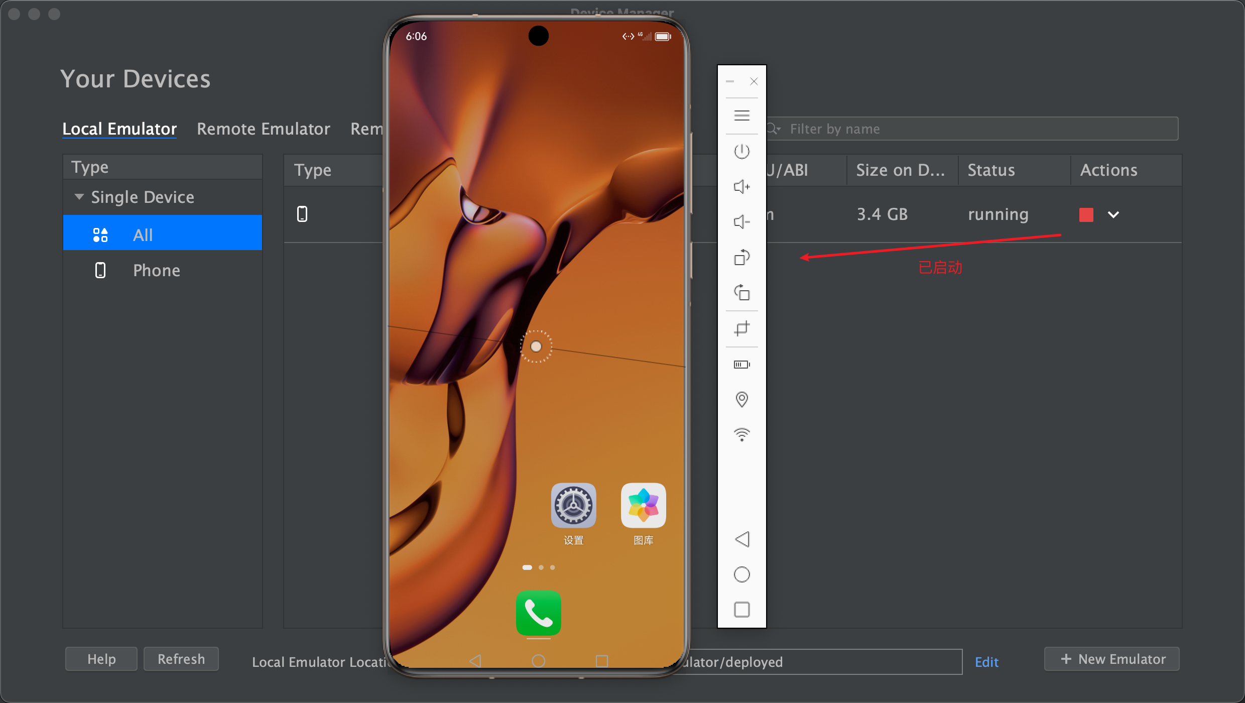
Local Emulator 本地模拟器
Remote Emulator 远程模拟器
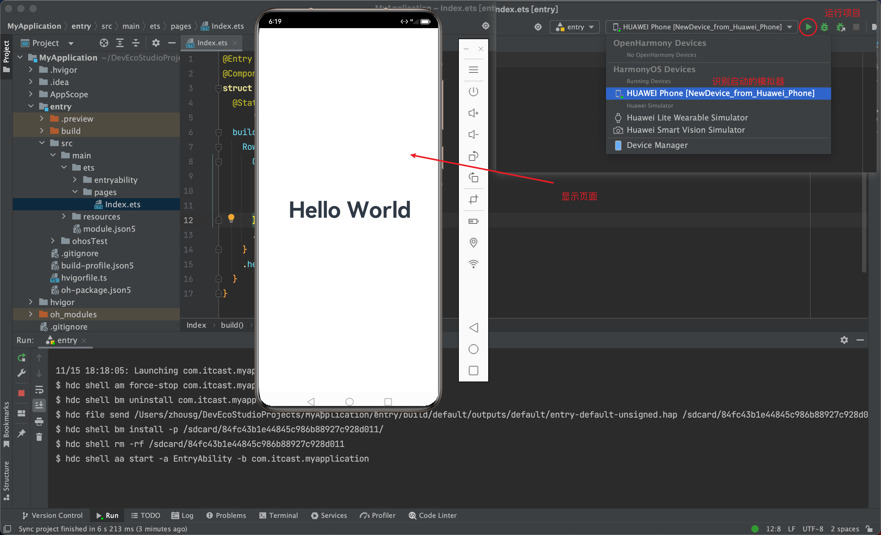
Remote Device 远程真机
Local Device 本地真机
推荐使用
Previewer 预览 和 Local Emulator 本地模拟器;
尤其推荐使用 遥遥领先 真机调试;
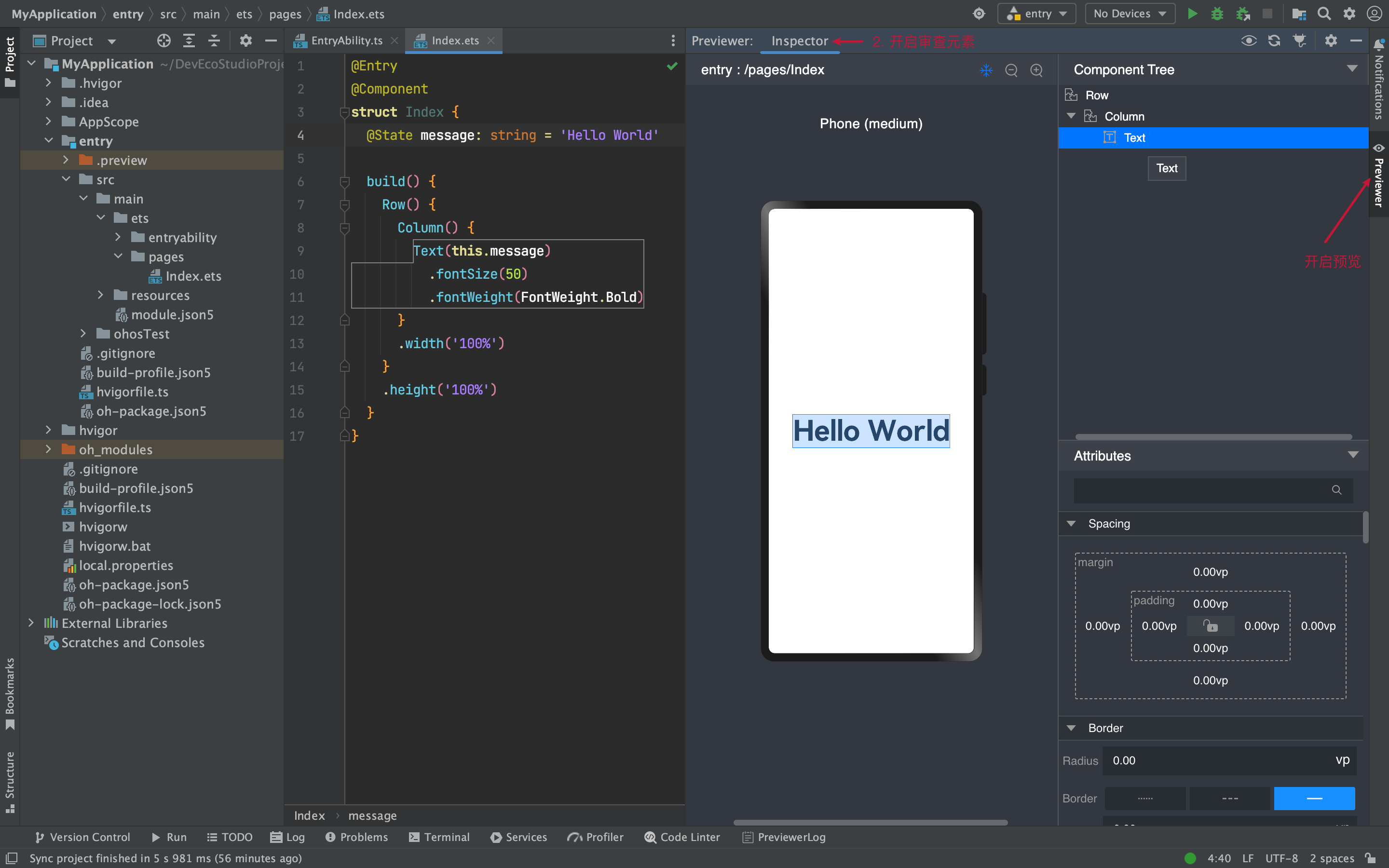
1)Previewer 预览
场景:静态页面(没有组件间数据通信、不涉及到网络请求)
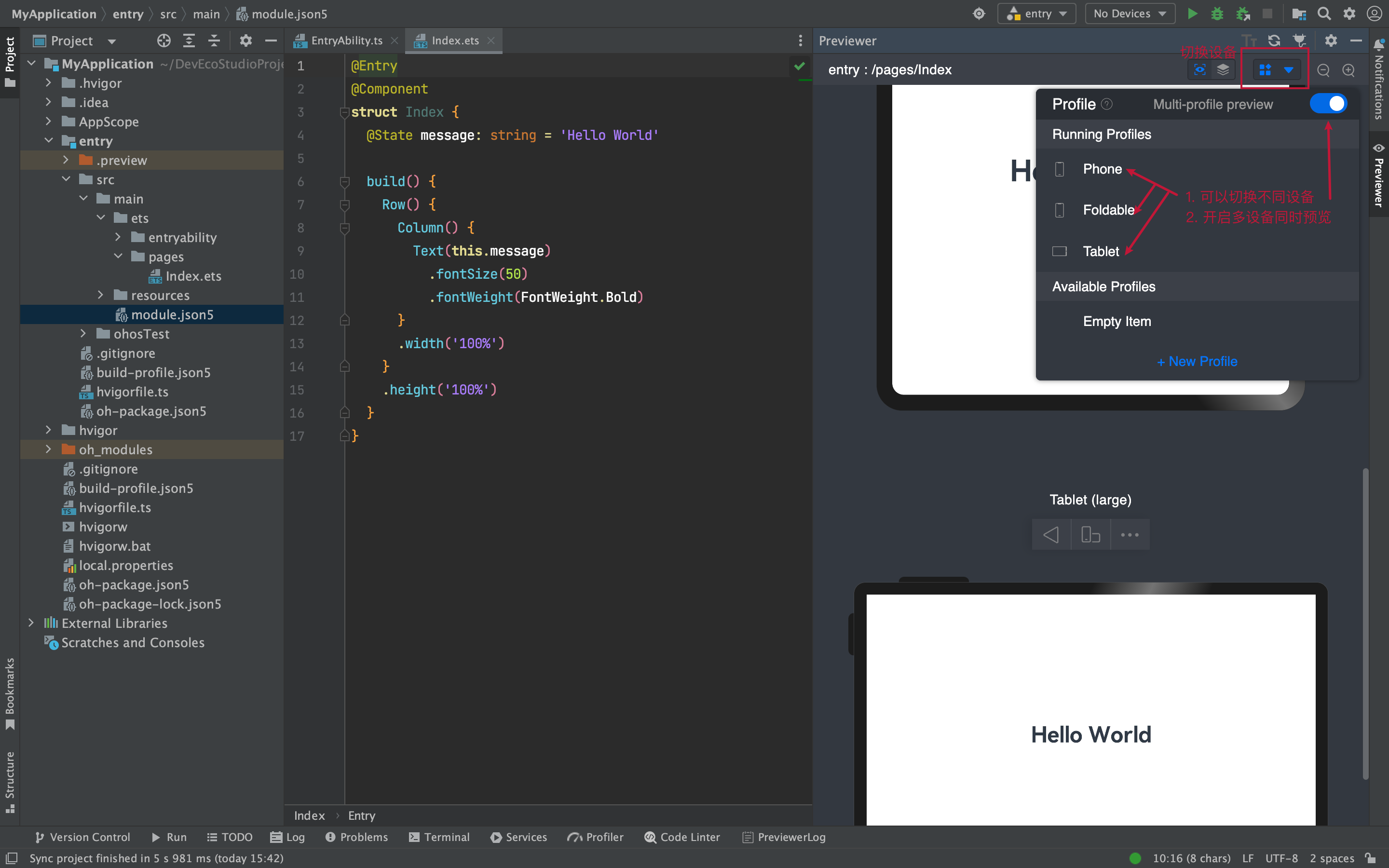
预览和审查元素
多设备预览
2)Local Emulator 本地模拟器
场景:动态页面(几乎全场景,一些无法模拟的硬件功能)
其他方式
Remote Emulator 远程模拟器
Remote Device 远程真机
Local Device 本地真机
条件:
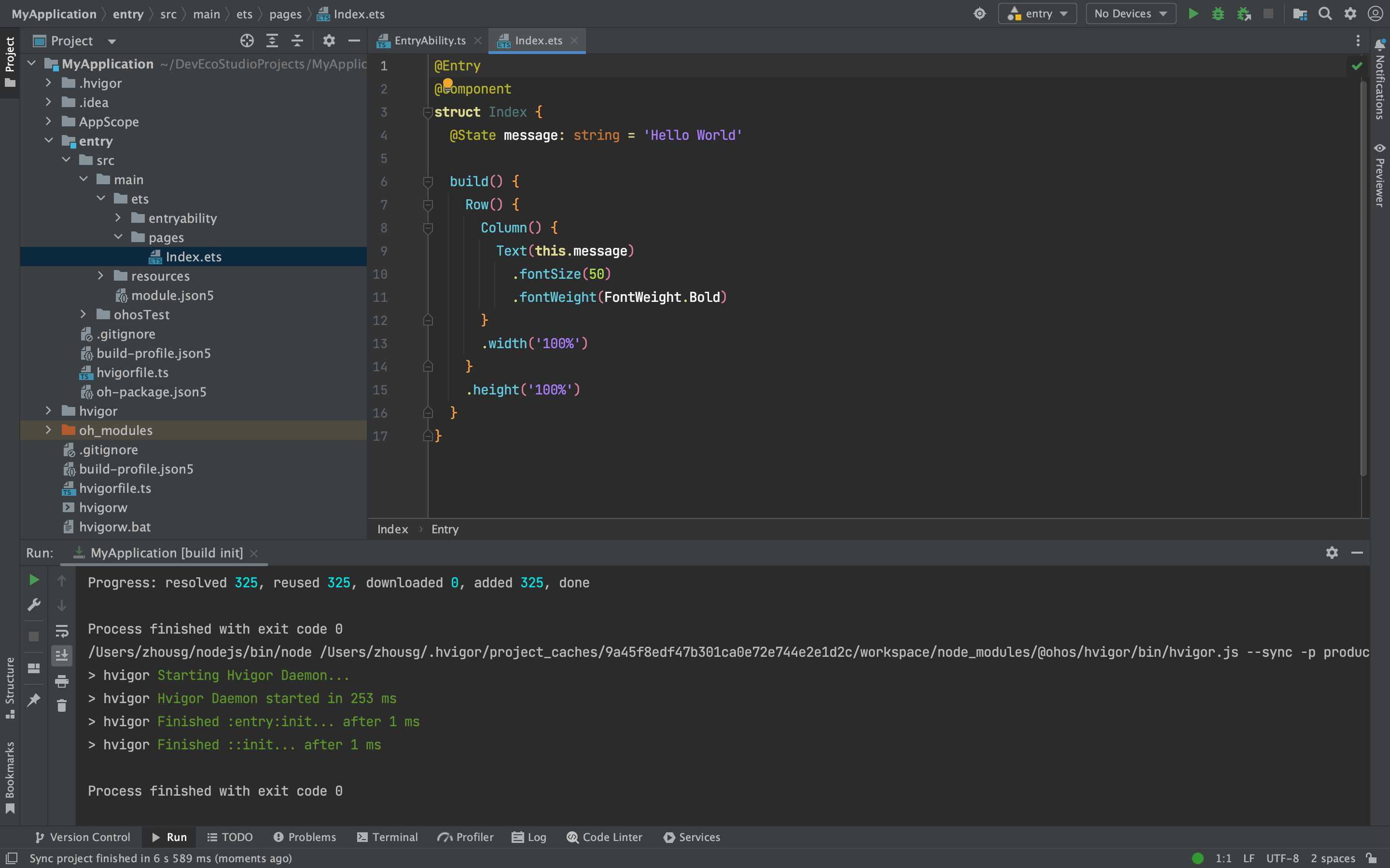
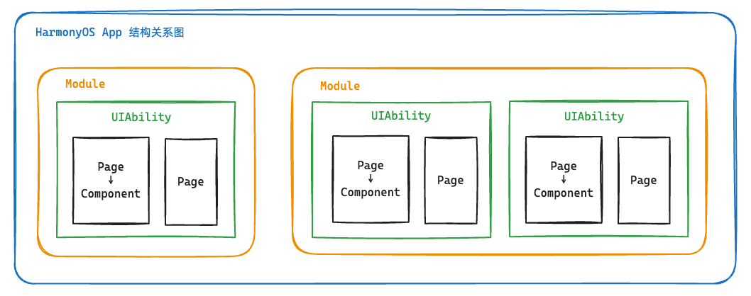
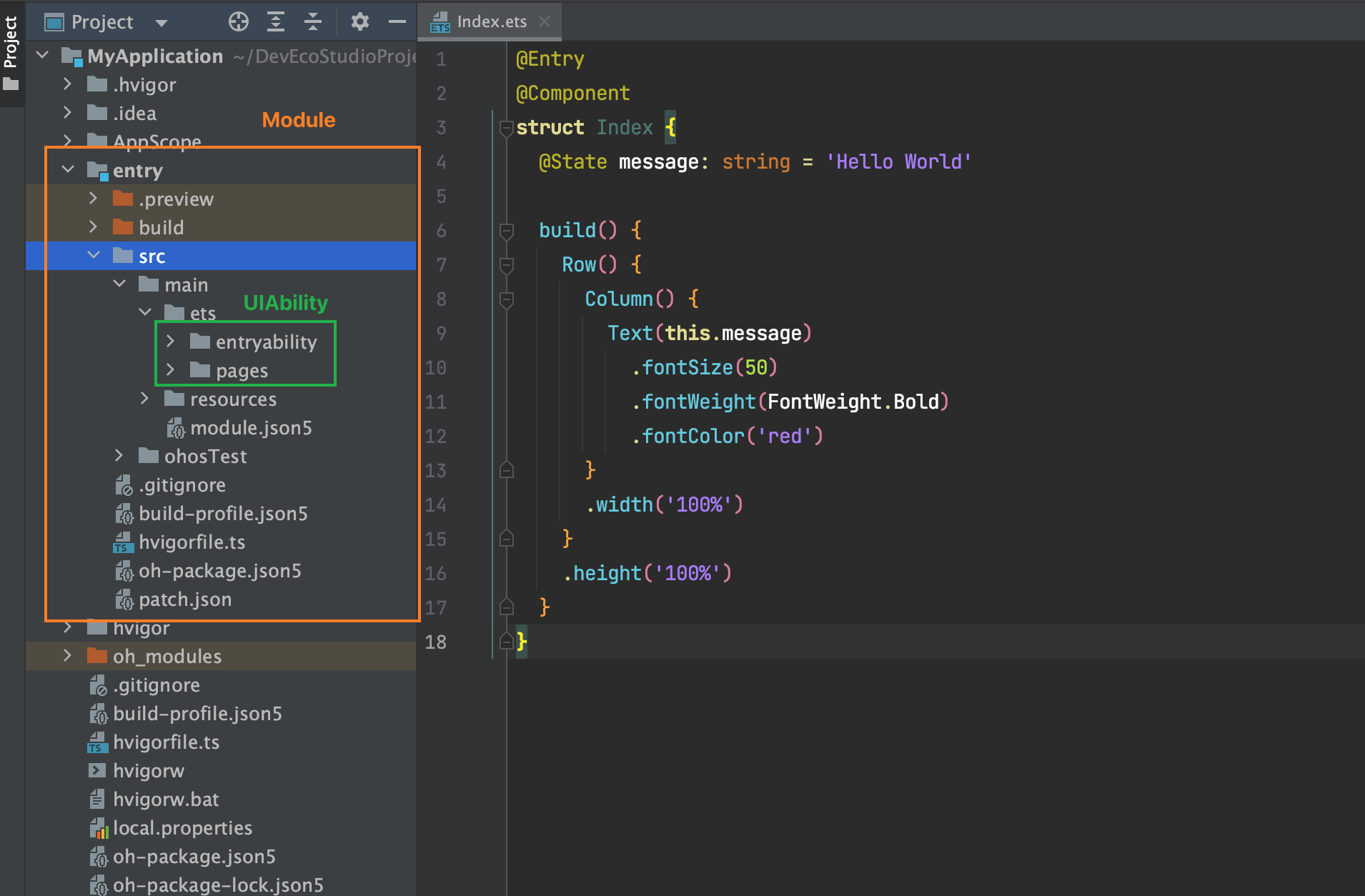
5. 起步-工程结构
我们在哪里写代码?
Stage 模型
了解App结构关系,等后面我们项目阶段来讲一些工程配置文件作用,现在你要知道:
组件基础
1. 组件-什么是ArkTS
ArkTS是HarmonyOS优选的主力应用开发语言。ArkTS围绕应用开发在TypeScript(简称TS)生态基础上做了进一步扩展,继承了TS的所有特性,是TS的超集。
扩展能力如下:
基本语法
定义声明式UI、自定义组件、动态扩展UI元素;
提供ArkUI系统组件,提供组件事件、方法、属性;
共同构成 UI 开发主体
状态管理
渲染控制
声明式UI?
问题?通过一段 HTML 标签展示出对应的页面方便,还是使用 document.createElement('tag')创建标签构建页面方便?
显然是 HTML , 其实 HTML 本身就是声明式的,通过描述的方式去声明 UI 界面。
一些前端框架也是声明式UI,如 Vue 使用的 tempalte 模板,如 React 使用的 JSX。
在例如现在的 Jetpack Compose SwiftUI Flutter 等APP开发技术也是声明式。
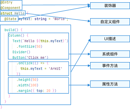
2. 基础-组件结构
ArkTS通过装饰器 @Component 和 @Entry 装饰 struct 关键字声明的数据结构,构成一个自定义组件。
自定义组件中提供了一个 build 函数,开发者需在该函数内以链式调用的方式进行基本的 UI 描述,UI 描述的方法请参考 UI 描述规范。
1)页面组件
1 @ Entry
2 @ Component
3 struct Index {
4 // 工程默认显示 `Index` 页面组件
5 // build 是声明UI的位置
6 build ( ) {
7 Text ( '页面组件' )
8 }
9 } 2)自定义组件
1 // 定义 `Footer` 组件
2 @ Component
3 struct Footer {
4 build ( ) {
5 Text ( '自定义组件' )
6 }
7 }
8
9 @ Entry
10 @ Component
11 struct Index {
12 build ( ) {
13 Column ( ) {
14 // 使用 `Footer` 组件
15 Footer ( )
16 }
17 }
18 } 为了更好维护,自定义组件通常会新建一个文件 Footer.ets,通过模块化语法导出导入(默认|按需)使用。
components/Footer.ets
1 @ Component
2 export default struct Footer {
3 build ( ) {
4 Text ( '自定义组件' )
5 }
6 } Index.ets
1 import Footer from './components/Footer.ets'
2
3 @ Entry
4 @ Component
5 struct Index {
6 build ( ) {
7 Column ( ) {
8 // 使用 `Footer` 组件
9 Footer ( )
10 }
11 }
12 } TIP
@Entry @Component 是页面组件,将来需要页面跳转就需要再定义一个页面。@Component 自定义组件,一个页面组件下可以有多个自定义组件。build(){} 只能有一个根元素
3. 基础-系统组件(ArkUI)
常用系统组件 Text Column Row Button TextInput 更多组件
Text 文本组件
Column 列组件,纵向排列,Flex布局主轴是Y
Row 行组件,横向向排列,Flex布局主轴是X
Button 按钮组件
InputText 输入框组件
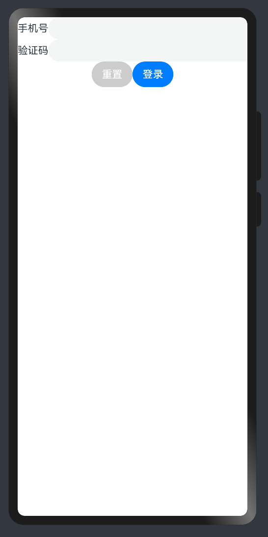
实现一个简易登录界面:
1 @ Entry
2 @ Component
3 struct Index {
4
5 build ( ) {
6 Column ( ) {
7 Row ( ) {
8 Text ( '手机号' )
9 TextInput ( )
10 }
11 Row ( ) {
12 Text ( '验证码' )
13 TextInput ( )
14 }
15 Row ( ) {
16 Button ( '重置' ) . backgroundColor ( '#ccc' )
17 Button ( '登录' )
18 }
19 }
20 }
21 } TIP
ArkUI 组件一般都是 Flex 模式,大部分布局可以由行和列组成。
4. 基础-组件状态
如何使用 @State 定义一个状态变量?
1)组件变量,不具备驱动UI更新能力。
1 @ Entry
2 @ Component
3 struct Index {
4 count = 100
5
6 build ( ) {
7 Text ( this . count . toString ( ) )
8 . onClick ( ( ) => this . count ++ )
9 }
10 } 2)状态变量,指驱动UI更新的数据,加上 @State 装饰器即可,注意:加上类型 和初始值 。
1 @ Entry
2 @ Component
3 struct Index {
4
5 @ State
6 count : number = 100
7
8 build ( ) {
9 Text ( this . count . toString ( ) )
10 . onClick ( ( ) => this . count ++ )
11 }
12 } TIP
加上类型和初始值
状态变量不可设置的类型有:any undefined null 与复杂类型的联合类型
其他:
绑定事件在系统组件后链式使用 onXxxxx 进行绑定即可
使用 @ohos.promptAction 可以进行轻提示 promptAction.showToast({ message: 'Tip' })
📕📕📕 练习案例→实现登录表单数据收集、重置、模拟提交。
1 import promptAction from '@ohos.promptAction'
2 @ Entry
3 @ Component
4 struct Index {
5
6 @ State
7 mobile : string = ''
8 @ State
9 code : string = ''
10
11 build ( ) {
12 Column ( ) {
13 Row ( ) {
14 Text ( '手机号' )
15 TextInput ( { text : this . mobile } )
16 . onChange ( ( value ) => this . mobile = value )
17 }
18 Row ( ) {
19 Text ( '验证码' )
20 TextInput ( { text : this . code } )
21 . onChange ( ( value ) => this . code = value )
22 }
23 Row ( ) {
24 Button ( '重置' )
25 . backgroundColor ( '#ccc' )
26 . onClick ( ( ) => {
27 this . mobile = ''
28 this . code = ''
29 } )
30 Button ( '登录' )
31 . onClick ( ( ) => {
32 if ( this . mobile && this . code ) {
33 promptAction . showToast ( { message : ` ${ this . mobile } 登录成功 ` } )
34 } else {
35 promptAction . showToast ( { message : ` 请输入手机号或验证码 ` } )
36 }
37 } )
38 }
39 }
40 }
41 } 样式处理
1. 样式-语法(链式&枚举)
ArkTS以声明方式组合和扩展组件来描述应用程序的UI;
1)样式属性
属性方法以 . 链式调用的方式配置系统组件的样式和其他属性,建议每个属性方法单独写一行。
1 @ Entry
2 @ Component
3 struct Index {
4 build ( ) {
5 Text ( '演示' )
6 . backgroundColor ( 'red' )
7 . fontSize ( 50 )
8 . width ( '100%' )
9 . height ( 100 )
10 }
11 } 2)枚举值
对于系统组件,ArkUI还为其属性预定义了一些枚举类型。文档链接
1 @ Entry
2 @ Component
3 struct Index {
4 build ( ) {
5 Text ( '演示' )
6 . fontSize ( 50 )
7 . width ( '100%' )
8 . height ( 100 )
9 . backgroundColor ( Color . Blue )
10 . textAlign ( TextAlign . Center )
11 . fontColor ( Color . White )
12 }
13 } TIP
样式相关属性通过链式函数的方式进行设置
如果类型是枚举的,通过枚举传入对应的值
2. 样式-单位vp和适配
知道 vp 单位,以及适配思想
1) vp 是什么?virtual pixel
2)之前 vw 、rem 和 rpx 相对于屏幕宽度的单位,可以实现等比例适配,vp 可以吗?
1 import promptAction from '@ohos.promptAction'
2
3 @ Entry
4 @ Component
5 struct Index {
6 build ( ) {
7 Text ( '演示' )
8 . width ( '100%' )
9 . backgroundColor ( 'red' )
10 . onAreaChange ( ( oldArea , newArea ) => {
11 promptAction . showToast ( {
12 // 1. onAreaChange改变尺寸后会触发
13 // 2. newArea为现在元素尺寸
14 message : newArea . width . toString ( )
15 } )
16 } )
17 }
18 } 我们发现:不同的设备屏幕的宽度 vp 是不一致的,那怎么适配呢?
3)根据官方的文档,结合自己的理解,采用:伸缩布局,网格系统,栅格系统进行布局适配。
伸缩 layoutWeight(flex: number) 占剩余空间多少份,可以理解成CSS的 flex: 1
1 @ Entry
2 @ Component
3 struct Index {
4 build ( ) {
5 Row ( ) {
6 Text ( 'left' )
7 . layoutWeight ( 1 )
8 . backgroundColor ( 'red' )
9 Text ( 'right' )
10 . layoutWeight ( 2 )
11 . backgroundColor ( 'green' )
12 }
13 . width ( '100%' )
14 }
15 } 等比例,设置元素宽高比 aspectRatio(ratio: number)
1 @ Entry
2 @ Component
3 struct Index {
4 build ( ) {
5 Text ( 'left' )
6 . width ( '50%' )
7 // 宽高比例
8 . aspectRatio ( 1 )
9 . backgroundColor ( 'red' )
10 }
11 } TIP
vp 是鸿蒙默认单位,和屏幕像素有关,最终表现视觉大小在任何设备一致
鸿蒙一般以伸缩 layoutWeight、网格、栅格进行布局适配,如要等比例缩放可以设置高宽比 aspectRatio
📕📕📕 练习案例→实现知乎评论回复-评论区域
设计稿一般是1080px:(这里没有设计稿,提供了一些尺寸)
Nav
左侧返回按钮24vp高宽背景颜色#f5f5f5,图标12vp尺寸颜色#848484
标题18vp
Comment
头像尺寸32vp高宽,右侧间距10vp
标题15vp,颜色默认
内容16vp,颜色#565656
底部12vp,颜色#c3c4c5
1 @ Entry
2 @ Component
3 struct Index {
4 build ( ) {
5 Column ( ) {
6 // 导航
7 Row ( ) {
8 Row ( ) {
9 Image ( $r ( 'app.media.ic_public_arrow_left' ) )
10 . width ( 16 )
11 . aspectRatio ( 1 )
12 // svg 图标可以使用填充颜色
13 // .fillColor('red')
14 }
15 . width ( 24 )
16 . aspectRatio ( 1 )
17 . backgroundColor ( '#f5f5f5' )
18 . borderRadius ( 12 )
19 . justifyContent ( FlexAlign . Center )
20 . margin ( { left : 16 } )
21
22 Text ( '评论回复' )
23 . layoutWeight ( 1 )
24 . textAlign ( TextAlign . Center )
25 . padding ( { right : 40 } )
26 }
27 . height ( 40 )
28 . border ( { width : { bottom : 0.5 } , color : '#e4e4e4' } )
29 // 评论
30 Row ( ) {
31 Image ( $r ( 'app.media.avatar' ) )
32 . width ( 32 )
33 . aspectRatio ( 1 )
34 . borderRadius ( 16 )
35 Column ( { space : 5 } ) {
36 Text ( '周杰伦' )
37 . width ( '100%' )
38 . fontWeight ( FontWeight . Bold )
39 . fontSize ( 15 )
40 Text ( '大理石能雕刻出肌肉和皮肤的质感,那个年代的工匠好牛啊' )
41 . width ( '100%' )
42 Row ( ) {
43 Text ( '10-21 · IP属地北京' )
44 . fontSize ( 12 )
45 . fontColor ( '#c3c4c5' )
46 Row ( { space : 4 } ) {
47 Image ( $r ( 'app.media.ic_public_heart' ) )
48 . width ( 14 )
49 . aspectRatio ( 1 )
50 . fillColor ( '#c3c4c5' )
51 Text ( '100' )
52 . fontSize ( 12 )
53 . fontColor ( '#c3c4c5' )
54 }
55 }
56 . width ( '100%' )
57 . justifyContent ( FlexAlign . SpaceBetween )
58 }
59 . layoutWeight ( 1 )
60 . padding ( { left : 10 } )
61 }
62 . padding ( 15 )
63 . alignItems ( VerticalAlign . Top )
64 }
65 }
66 } 2. 样式-@Styles 复用
在开发过程中会出现大量代码在进行重复样式设置,@Styles 可以帮我们进行样式复用
当前 @Styles 仅支持 通用属性 和 通用事件 。
支持 全局 定义和 组件内 定义,同时存在组件内覆盖全局生效。
1 // 全局
2 @ Styles
3 function functionName ( ) { ... }
4
5 @ Entry
6 @ Component
7 sturt Index {
8 // 组件内
9 @ Styles
10 functionName ( ) { ... }
11
12 build ( ) {
13 Text ( 'Text' )
14 . functionName ( )
15 }
16 } 需求:文字和按钮相同背景,点击+1
1)全局
1 @ Styles function sameStyle ( ) {
2 . backgroundColor ( Color . Green )
3 . onClick ( ( ) => {
4 this . count ++
5 } )
6 }
7
8 @ Entry
9 @ Component
10 struct Index {
11 @ State
12 count : number = 10
13
14 build ( ) {
15 Column ( ) {
16 Text ( this . count . toString ( ) )
17 . width ( 100 )
18 . height ( 50 )
19 . margin ( { bottom : 10 } )
20 . textAlign ( TextAlign . Center )
21 . sameStyle ( )
22
23 Button ( '+1' )
24 . sameStyle ( )
25 }
26 . height ( '100%' )
27 . width ( '100%' )
28 . justifyContent ( FlexAlign . Center )
29 }
30 } 2)组件内
1 @ Entry
2 @ Component
3 struct Index {
4 @ State
5 count : number = 10
6
7 // 不需要 `function` 关键字,覆盖全局
8 @ Styles
9 sameStyle ( ) {
10 . backgroundColor ( Color . Pink )
11 . onClick ( ( ) => {
12 this . count += 10
13 } )
14 }
15
16 build ( ) {
17 Column ( ) {
18 Text ( this . count . toString ( ) )
19 . width ( 100 )
20 . height ( 50 )
21 . margin ( { bottom : 10 } )
22 . textAlign ( TextAlign . Center )
23 . sameStyle ( )
24
25 Button ( '+1' )
26 . sameStyle ( )
27 }
28 . height ( '100%' )
29 . width ( '100%' )
30 . justifyContent ( FlexAlign . Center )
31 }
32 } 📕📕📕 练习案例-登录表单-样式优化
1 import promptAction from '@ohos.promptAction'
2 @ Entry
3 @ Component
4 struct Index {
5
6 @ State
7 mobile : string = ''
8 @ State
9 code : string = ''
10
11
12 @ Styles
13 inputStyle ( ) {
14 . border ( { width : 1 , color : Color . Gray } )
15 . layoutWeight ( 1 )
16 . margin ( { left : 10 , bottom : 10 , top : 10 } )
17 . backgroundColor ( Color . White )
18 }
19
20 build ( ) {
21 Column ( ) {
22 Row ( ) {
23 Text ( '手机号' )
24 TextInput ( { text : this . mobile } )
25 . inputStyle ( )
26 . onChange ( ( value ) => this . mobile = value )
27 }
28 Row ( ) {
29 Text ( '验证码' )
30 TextInput ( { text : this . code } )
31 . inputStyle ( )
32 . onChange ( ( value ) => this . code = value )
33 }
34 Row ( { space : 15 } ) {
35 Button ( '重置' )
36 . backgroundColor ( '#ccc' )
37 . onClick ( ( ) => {
38 this . mobile = ''
39 this . code = ''
40 } )
41 Button ( '登录' )
42 . onClick ( ( ) => {
43 if ( this . mobile && this . code ) {
44 promptAction . showToast ( { message : ` ${ this . mobile } 登录成功 ` } )
45 } else {
46 promptAction . showToast ( { message : ` 请输入手机号或验证码 ` } )
47 }
48 } )
49 }
50 }
51 . padding ( { left : 15 , right : 15 } )
52 }
53 } 3. 样式-@Extends 复用
@Extend 用于扩展原生组件样式,通过传参提供更灵活的样式复用
使用 @Extend 装饰器修饰的函数只能是 全局
函数可以进行 传参 ,如果参数是状态变量,状态更新后会刷新UI
且参数可以是一个函数,实现复用事件且可处理不同逻辑
1 // 全局 原生组件 参数
2 // ↓ ↓ ↓
3 @ Extend ( Text ) function functionName ( w : number ) {
4 . width ( w )
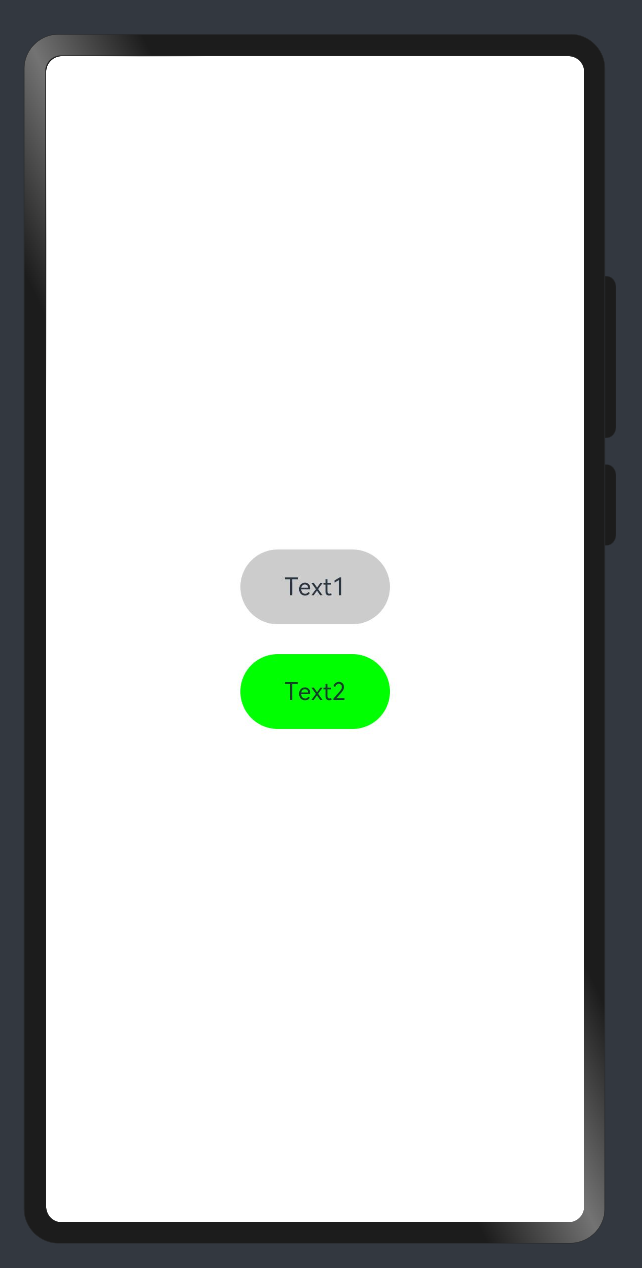
5 } 需求:把 Text 改成按钮样式,且绑定 click 事件执行不同逻辑
1 import promptAction from '@ohos.promptAction'
2
3 @ Extend ( Text ) function myClick ( color : string , cb : ( ) => void ) {
4 . backgroundColor ( color )
5 . width ( 100 )
6 . height ( 50 )
7 . textAlign ( TextAlign . Center )
8 . borderRadius ( 25 )
9 . onClick ( ( ) => cb ( ) )
10 }
11
12 @ Entry
13 @ Component
14 struct Other {
15 @ State
16 color : string = '#ccc'
17
18 build ( ) {
19 Column ( { space : 20 } ) {
20 Text ( 'Text1' )
21 . myClick ( this . color , ( ) => {
22 this . color = '#069'
23 } )
24 Text ( 'Text2' )
25 . myClick ( 'green' , ( ) => {
26 promptAction . showToast ( { message : '做其他事~' } )
27 } )
28 }
29 . width ( '100%' )
30 . height ( '100%' )
31 . justifyContent ( FlexAlign . Center )
32 }
33 } 4. 样式-多态
stateStyles() 可以依据组件的内部状态的不同,快速设置不同样式。
stateStyles 是属性方法,可以根据UI内部状态来设置样式,类似于 css 伪类,但语法不同。ArkUI 提供以下四种状态:
focused:获焦态。
normal:正常态。
pressed:按压态。
disabled:不可用态。
1 import promptAction from '@ohos.promptAction'
2
3 // 胶囊按钮
4 @ Extend ( Text )
5 function capsule ( ) {
6 . height ( 40 )
7 . borderRadius ( 20 )
8 . backgroundColor ( Color . Gray )
9 . padding ( { left : 15 , right : 15 } )
10 . margin ( { bottom : 15 } )
11 }
12
13 @ Entry
14 @ Component
15 struct Index {
16 @ State
17 disabled : boolean = false
18 @ State
19 focused : boolean = false
20
21 build ( ) {
22 Column ( ) {
23
24 // Button TextInput 默认开启获取焦点,页面中默认第一个这样的元素获取焦点
25 // Button 比较多限制,一个是默认开启获取焦点能看,二是禁用状态下样式无法修改
26 // Button('Button').focusable(false)
27
28 Text ( 'toggle disabled:' + this . disabled )
29 . capsule ( )
30 . onClick ( ( ) => {
31 this . disabled = ! this . disabled
32 } )
33 Text ( 'toggle focused:' + this . focused )
34 . capsule ( )
35 . onClick ( ( ) => {
36 this . focused = ! this . focused
37 } )
38 Text ( 'clickMe' )
39 . capsule ( )
40 . enabled ( ! this . disabled )
41 . focusable ( this . focused )
42 . onClick ( ( ) => {
43 promptAction . showToast ( { message : 'click' } )
44 } )
45 . fontColor ( '#fff' )
46 . stateStyles ( {
47 normal : {
48 . backgroundColor ( Color . Blue )
49 } ,
50 focused : {
51 . backgroundColor ( Color . Red )
52 } ,
53 disabled : {
54 . backgroundColor ( Color . Black )
55 } ,
56 pressed : {
57 . backgroundColor ( Color . Orange )
58 }
59 } )
60 }
61 }
62 } TIP
使用比较多的应该是 normal pressed 结合下的按压效果
enabled(true|false) 开启|禁用 focusable(true|false) 开启获取焦点能力|关闭
注意:
页面初始化的时候,默认第一个能获取焦点的元素,会自动获取焦点
组件状态
1. 状态-class语法
在鸿蒙开发中关于对象状态范式采用 class 方式,后续组件传值遇到深层对象嵌套需要利用 class
1)class 创建对象和 class 类型
1 class Person {
2 age : number ;
3 name : string ;
4
5 constructor ( name : string , age : number ) {
6 this . name = name
7 this . age = age
8 }
9 }
10
11 // 当类型使用和构当造函数使用
12 const p : Person = new Person ( 'jack' , 18 )
13 // 当类型使用这种使用后续居多,我们使用字面量对象居多,可以省略 constructor
14 const p1 : Person = {
15 name : 'tom' ,
16 age : 20
17 } 2)implements 实现 interface 接口
1 interface IPerson {
2 name : string ,
3 age : number ,
4 say : ( ) => void
5 }
6
7 // 实现 IPerson 接口,需要符合接口约定
8 class Person implements IPerson {
9 age : number ;
10 name : string ;
11
12 constructor ( name : string , age : number ) {
13 this . name = name
14 this . age = age
15 }
16
17 say ( ) {
18 promptAction . showToast ( { message : this . name } )
19 }
20 } 3)extends 继承
1 class HmPerson extends Person {
2 github : string = 'https://github.com/zhousg'
3
4 coding ( ) {
5 promptAction . showToast ( { message : this . name + ': coding' } )
6 }
7 } TIP
定义类 class 类名 { 属性 + 构造器 + 方法 },类可以创建对象,也可以当类型 使用。
扩展:
class 可以实现 implements 接口,需要受到接口约束
class 可以继承 extends 另外一个class的属性和方法
2. 状态-复杂状态
当装饰的数据类型为class或者Object时,可以观察到自身的赋值的变化,和其属性赋值的变化,即Object.keys(observedObject)返回的所有属性。
1)对象类型状态
1 // 对象模型
2 class User {
3 nickname : string
4 age : number
5 }
6
7 @ Entry
8 @ Component
9 struct Index {
10
11 @ State
12 user : User = { nickname : 'jack' , age : 18 }
13
14 build ( ) {
15 Column ( { space : 20 } ) {
16 Text ( this . user . nickname )
17 Text ( this . user . age . toString ( ) )
18 Button ( 'age++' )
19 . onClick ( ( ) => {
20 this . user . age ++
21 } )
22 }
23 . width ( '100%' )
24 . height ( '100%' )
25 . justifyContent ( FlexAlign . Center )
26 }
27 } 2)嵌套对象类型状态
1 // 对象模型
2 class User {
3 nickname : string
4 age : number
5 }
6
7 class UserData {
8 code : number
9 message : string
10 // 嵌套对象
11 data : User
12 }
13
14 @ Entry
15 @ Component
16 struct Index {
17 @ State
18 res : UserData = {
19 code : 10000 ,
20 message : '获取用户信息成功' ,
21 // 嵌套对象
22 data : { nickname : 'jack' , age : 18 }
23 }
24
25 build ( ) {
26 Column ( { space : 20 } ) {
27 Text ( this . res . data . nickname )
28 Text ( this . res . data . age . toString ( ) )
29 Button ( 'age++' )
30 . onClick ( ( ) => {
31 // ❌ this.res.data.age ++
32 const user = this . res . data
33 // 替换属性,触发UI更新
34 this . res . data = { ... user , age : user . age + 1 }
35 } )
36 }
37 . width ( '100%' )
38 . height ( '100%' )
39 . justifyContent ( FlexAlign . Center )
40 }
41 } 3)对象数组类型状态
1 // 对象模型
2 class User {
3 nickname : string
4 age : number
5 }
6
7 @ Entry
8 @ Component
9 struct Index {
10 @ State
11 list : User [ ] = [
12 { nickname : 'jack' , age : 18 } ,
13 { nickname : 'tom' , age : 16 }
14 ]
15 build ( ) {
16 Column ( { space : 20 } ) {
17 Text ( JSON . stringify ( this . list [ 0 ] ) )
18 Text ( JSON . stringify ( this . list [ 1 ] ) )
19 Button ( 'age++' )
20 . onClick ( ( ) => {
21 // ❌ this.list[1].age ++
22 const user = this . list [ 1 ]
23 this . list [ 1 ] = { ... user , age : user . age + 1 }
24 } )
25 }
26 . width ( '100%' )
27 . height ( '100%' )
28 . justifyContent ( FlexAlign . Center )
29 }
30 } TIP
使用 class 来约束对象类型,和嵌套对象和对象数组。
嵌套对象和对象数组,采用赋值的方式进行更新,可以更新UI。
🚦 后期如果学习组件传值,会给大家补充另外一种深层数据变更更新UI的方式
界面渲染
1. 渲染-条件渲染
条件渲染可根据应用的不同状态,使用if、else和else if渲染对应状态下的UI内容。
条件渲染,是根据状态数据进行判断展示不同UI
条件渲染,是会销毁和创建组件,组件状态将不会保留
1)使用 if else 实现 loading 效果
1 @ Entry
2 @ Component
3 struct Index {
4
5 @ State
6 loading : boolean = false
7
8 build ( ) {
9 Column ( { space : 20 } ) {
10 if ( this . loading ) {
11 LoadingProgress ( )
12 . width ( 100 )
13 . height ( 100 )
14 } else {
15 Text ( '后台数据' )
16 Text ( '后台数据' )
17 Text ( '后台数据' )
18 }
19 Button ( '更新数据' )
20 . onClick ( ( ) => {
21 this . loading = true
22 setTimeout ( ( ) => {
23 this . loading = false
24 } , 2000 )
25 } )
26 }
27 . width ( '100%' )
28 . height ( '100%' )
29 . justifyContent ( FlexAlign . Center )
30 }
31 } 2)添加渲染会销毁和重新创建组件,组件状态将不会保留。
1 @ Component
2 struct CounterComp {
3 @ State
4 count : number = 0
5
6 build ( ) {
7 Text ( this . count . toString ( ) )
8 . onClick ( ( ) => {
9 this . count ++
10 } )
11 }
12 }
13
14 @ Entry
15 @ Component
16 struct Index {
17
18 @ State
19 show : boolean = true
20
21 build ( ) {
22 Column ( { space : 20 } ) {
23 if ( this . show ) {
24 // 累计的 count 切换时候不会保留
25 CounterComp ( )
26 }
27 Button ( 'toggle' )
28 . onClick ( ( ) => {
29 this . show = ! this . show
30 } )
31 }
32 . width ( '100%' )
33 . height ( '100%' )
34 . justifyContent ( FlexAlign . Center )
35 }
36 } 2. 渲染-循环渲染
ForEach 接口基于数组类型数据来进行循环渲染,需要与容器组件配合使用。
语法:
1 ForEach (
2 // 数据源
3 arr : Array ,
4 // 组件生成函数
5 itemGenerator : ( item : Array , index ? : number ) => void ,
6 // 键值生成函数
7 keyGenerator ? : ( item : Array , index ? : number ) : string => string
8 ) 应用:
1 class User {
2 id : string
3 name : string
4 age : number
5 }
6
7
8 @ Entry
9 @ Component
10 struct Index {
11 @ State
12 userList : User [ ] = [ ]
13
14 build ( ) {
15 Scroll ( ) {
16 Column ( { space : 20 } ) {
17 // 循环渲染
18 ForEach (
19 // 1. 数据源
20 this . userList ,
21 // 2. 组件生成函数
22 ( item : User ) => {
23 // 内容
24 Text ( ` ${ item . name } 今年 ${ item . age } 岁 ` )
25 } ,
26 // 3. 键值生成函数
27 item => item . id
28 )
29 Button ( '加载更多' )
30 . onClick ( ( ) => {
31 const arr : User [ ] = [ ]
32 for ( let index = 0 ; index < 10 ; index ++ ) {
33 arr . push ( { id : Math . random ( ) . toString ( ) , name : 'jack' , age : Math . ceil ( Math . random ( ) * 100 ) } )
34 }
35 this . userList . push ( ... arr )
36 } )
37 }
38 }
39 . width ( '100%' )
40 }
41 } TIP
关于 keyGenerator 键生成函数的一些建议:
不能缺省
避免最终生成的键包含 index
对象数组,建议使用对象中 id 唯一标识
基本数据数字,建议转换成具有 id 唯一标识的对象,再使用